The Downtown Heart of the Harbour is no more.
With a membership nearing 100, the soon-to-be 30-year-old business improvement association is looking to the future with a new vision, new name and new logo to lead the charge into the Prince Arthur’s Landing era.
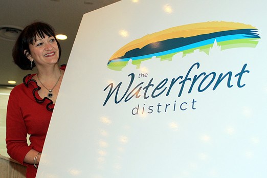
On Tuesday the BIA announced it was rebranding the north core of the city to the Waterfront District, an identity designed to revitalize an historic area that has seen traffic dwindle and money spent elsewhere.
"With everything that’s happening at the waterfront, we wanted to be proactive and make sure that we had something exciting – a new name, a new look and exciting things happening in the downtown heart of the harbor," said BIA president Suzan Cooper-Rochon.
"With the waterfront development and the eventual connection of Red River Road to the waterfront, there will be lots of traffic and revitalization in the downtown. And we just wanted to be moving forward with that and to be ahead of that a bit."
The change in direction comes 24 years after the Heart of the Harbour moniker was adopted, which took over from the original Northward Business Association, formed in 1981 to offset the Intercity effect that had begun drawing shoppers out in droves.
The new look comes with a new logo, a blimp-shaped design featuring a blue Sleeping Giant as its centerpiece, a sunrise, Lake Superior and a swath of green representing Marina Park. White outlines of several of the district’s more prominent buildings, including the Pagoda and Magnus Theatre, are overlaid across the bottom of the design, with the new name written underneath.
Cooper-Rochon, owner of the Perfect Fit lingerie shop, said the overall vision of an all-inclusive waterfront area should make it a success – if it’s pulled off as planned.
"Part of that is hoping for people to be living and working in the downtown," she said. "Also St. Paul Street will be redone and we are working with the city as how we would like to see it. We have visions for maybe a small market area, where we’d like to see little cafes out on the street."
Stephanie Ash, whose company Fire Dog Communications designed the new logo and helped create the Waterfront District concept, said the idea is to get people excited about their downtown core all over again.
"We’ve got green space, we’ve got beautiful waterfront development, so I really think it’s just reminding people why the downtown core is so great and encouraging them to come out, visit us, go shopping at our businesses," said Ash, who’s called the district home for seven years.
"The more successful this area is, the more successful we all are."
Ash acknowledged the former Port Arthur downtown has suffered through an image crisis in recent years, with a perceived growth in crime and safety worries on the minds of potential shoppers day and night, but said the city is working on initiatives – like police foot patrols – that should calm those fears.
Ash said the new brand will be marketed inside the city and out, and she’s confident it will work.
"Within our strategic plan are definite goals of what we want to achieve over the next five years, with a long-term vision in mind. And that is to create a diverse, mixed-used downtown that is safe and that’s beautiful," she said.
Sign in or register
- Messages
- Post a Listing
- Your Listings
- Your Profile
- Your Subscriptions
- Your Likes
- Your Business
- Support Local News
- Payment History
Registered Users
Already have an account?
New Users
Create a free account.