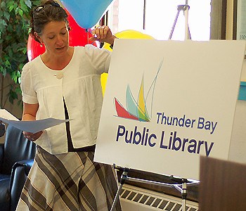
The Thunder Bay Public Library hopes a new logo will help give it a more 21st century look and feel.
The library released its new colourful logo to replace the older version Monday. The search for the new logo started back in the fall and had 20 potential designs before the library board members made a final decision.
Janine Chiasson, writer for Generator Strategy Advertising, said the design tried to capture a loose, free brush stroke feel similar to a child’s exuberance. She said the designers came up with designs that were more serious but chose to go with the more colourful design based on input from focus groups.
She said the design of the logo reminded her of a book unfolding.
"People were asking for more colour, something more exciting and something that would bring us into this millennium," Chiasson said. "We chose a logo that is colourful and we think it will excite children and that it is appealing to adults."
Traditionally, libraries only offered books, some other print publications and limited multimedia access. Over the years the library changed and became more modern by including Internet access, audio books and other multimedia technology.
Chiasson said the new logo helped to illustrate how libraries have changed. She said people’s perceptions needed to change as well.
"I think people still have the impression that libraries are a place you aren’t suppose to talk," she said. "Talkers are wanted and no librarians are shushing people up anymore. We want this to be an invitation. People are meant to come to libraries and live here."
Gina La Force, chief librarian with Thunder Bay Public Library, said the designed cost about $20,000 and the last time the public library changed its brand happened in 1990s. She said she hoped the new logo would attract residences that hadn’t given the library much thought.
"We want people who are walking who think it’s the same old library to come in and check it out again," La Force said. "The new logo makes the library a little harder to walk by instead of boxy lettering that says TBPL, which could mean just about anything."
La Force said they are looking to make the library into a more lively place that offers beverages such as coffee.
However, the library would still offer a quiet area for those seeking silence, she said.
Sign in or register
- Messages
- Post a Listing
- Your Listings
- Your Profile
- Your Subscriptions
- Your Likes
- Your Business
- Support Local News
- Payment History
Registered Users
Already have an account?
New Users
Create a free account.